ABOUT SKY HACIENDA

June Donaldson and Edward Garry live at an altitude of 2,600 metres in Mosoj Llajta, Yotala, 20 minutes from the colonial city of Sucre in Bolivia, South America. Using earth and stones from the land, we have sculpted beautiful buildings which compliment the high desert landscape and incorporate creative and innovative elements of design.

We have designed a high quality hotel in Sucre for guests who want to get off the treadmill of travelling from city to city in South America. At Sky Hacienda you can dictate your own timing and choose how to enjoy your stay, whether it is doing very little or exploring the best that the Andes in Bolivia has to offer.

29 October 2011

SHOWING OFF THE KITCHEN

The view from the kitchen sink.
After a year of running the kitchen from our utility room, complete with camping two-burner stove, our new, improved version was ready to function. 

For anyone who is passionate about food, designing their own kitchen is a dream come true.  True, I had to consider the logistics of catering for large numbers of guests but in that regard it just meant a bigger area for plating up, which was fine by me.   If you were to mentally divide the circular living room into three wedges, the kitchen would form one wedge, leaving plenty of room for dining and relaxing. 
Ed's design feature in the countertop.
The  big double sink - perfect for burying dirty dishes for a while.

The vegetable sink.

Below the hob are two built in ovens.

This side of the island is the bar, complete with niches for stools.

We still had to install the cooker hood ventilation system, but that would have to wait until the mezzanine floor had been installed.

19 October 2011

UPDATES

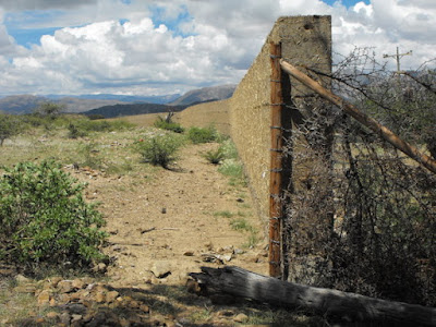
Our perimeter wall is finally finished - over a kilometre long and built almost single-handedly over a 2-year period by Cyprian.
We used posts and barbed wire for the sloped part of our land, reinforced with thorn branches to keep animals out.
Ed installs blue glass in the pool wall.
Volunteers Fabio and Vikki continue working on the mosaic in the jacuzzi.
The large, heavy solid wood door to the principal bedroom arrives.....
...and is carefully installed in the arched opening.
And our outbuildings are finally ready to use - Ed's workshop, a bedroom and bathroom, a laundry room and storage room.

13 October 2011

THE BATHTUB PART 1

Way back in the early days of the building of the Roundhouse we made a pedestal in the principle bedroom that would eventually support a hand-made bathtub. With the bathrooms well on their way to being completed we turned our attention to the design of the bathtub.

We decided on a half an egg shape, simple and elegant, black in colour and made of our favourite material - concrete.

A mould was made from exactly the same ingredients used to make an adobe brick - mud, straw and water.
The mold was then covered in plaster before being given a coat of resin to create a smooth surface.
A wire cage was made to reinforce the bathtub.
A black cement mix was layered onto the the mould.
The shiny resin surface being covered.
The outside of the shell was trowelled smooth and left to dry.


04 October 2011

BATHROOMS

We had lived for many months with no fixed handwashing facilities in our bathrooms and raw concrete on the walls in the shower areas. So it was time to tackle upgrading the rooms starting with the corner units to support the above-counter washbasins.

We followed the same principal used for the countertops in the kitchen.
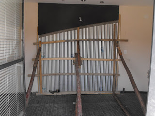
After struggling to find tiling that fitted in with our design we decided to use concrete - a smooth black finish on the upper section and white cement given a corrugated effect with the aid of metal roofing material.
Frames were made to hold the metal in place then braced to hold the structure firmly against the wall.
In the picture below you can see the completed counter top in the background with the washbasin installed.
The white cement was then mixed and poured in behind the structure and left to dry.  We were really pleased with the final effect with the contrasts of colour and texture.   We planned to install a wooden insert between the upper and lower section to add warmth to the overall design.